New Logo for Cabert:
A new symbol, the same heart.
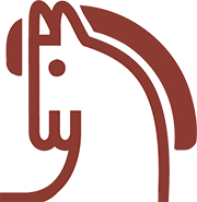
Paying homage to tradition with a contemporary vision: the updated design reflects Cabert‘s brand’s evolution, combining respect for tradition and a look to the future.
The horse, now in motion, represents progress and innovation, while the more geometric and minimal lines convey elegance and dynamism. This change symbolizes their commitment to grow and adapt to a constantly changing market, without ever losing their identity.


The new logo, even on the cork. 
Cabert has chosen cork for our bottles—a timeless symbol of tradition, quality and sustainability.
Cabert….where each bottle tells a story of evolution and deep-rooted heritage.
source: cabert

